︎
Works
2019
M1 Singapore Fringe Festival 2019
Identity and Promotional Graphics
Client:
The Necessary Stage
Creative and Art Direction
in Collaboration with:
Liqin Lau
Logotype Animation:
Jonathan Chen
Website Developer:
Shirley Tan
︎ 2019’s Edition
︎ M1 Singapore Fringe Festival
The Necessary Stage
Creative and Art Direction
in Collaboration with:
Liqin Lau
Logotype Animation:
Jonathan Chen
Website Developer:
Shirley Tan
︎ 2019’s Edition
︎ M1 Singapore Fringe Festival
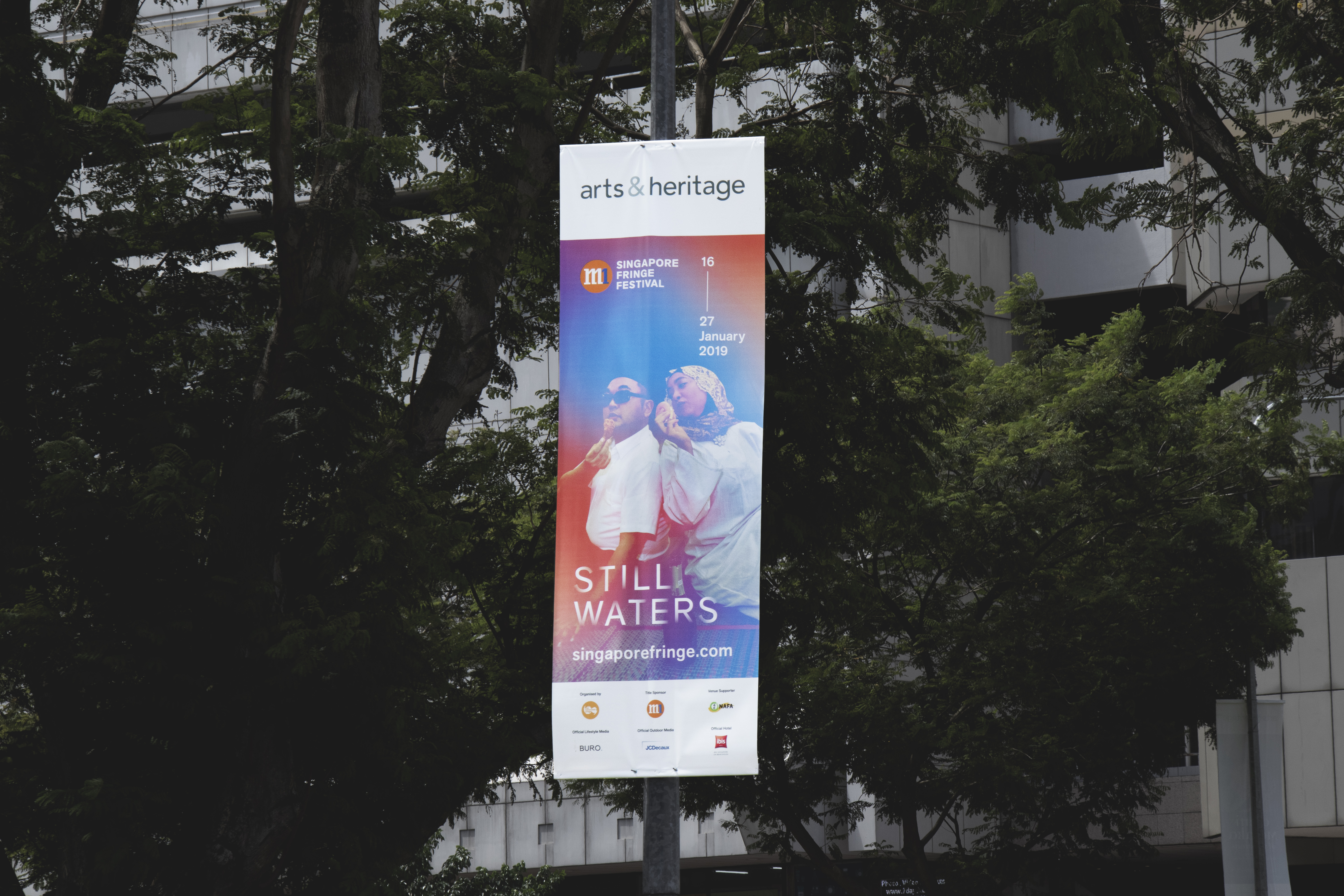
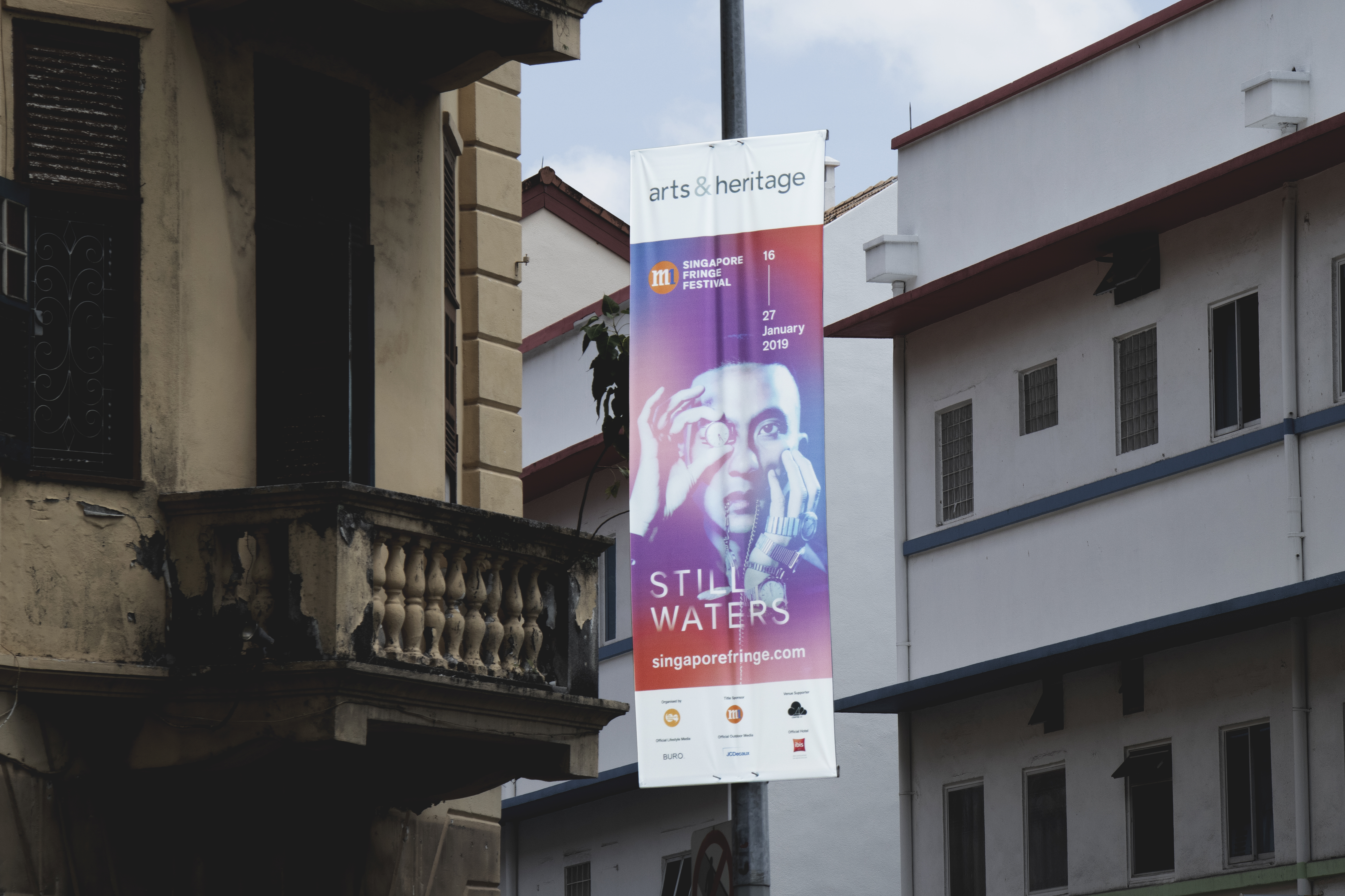
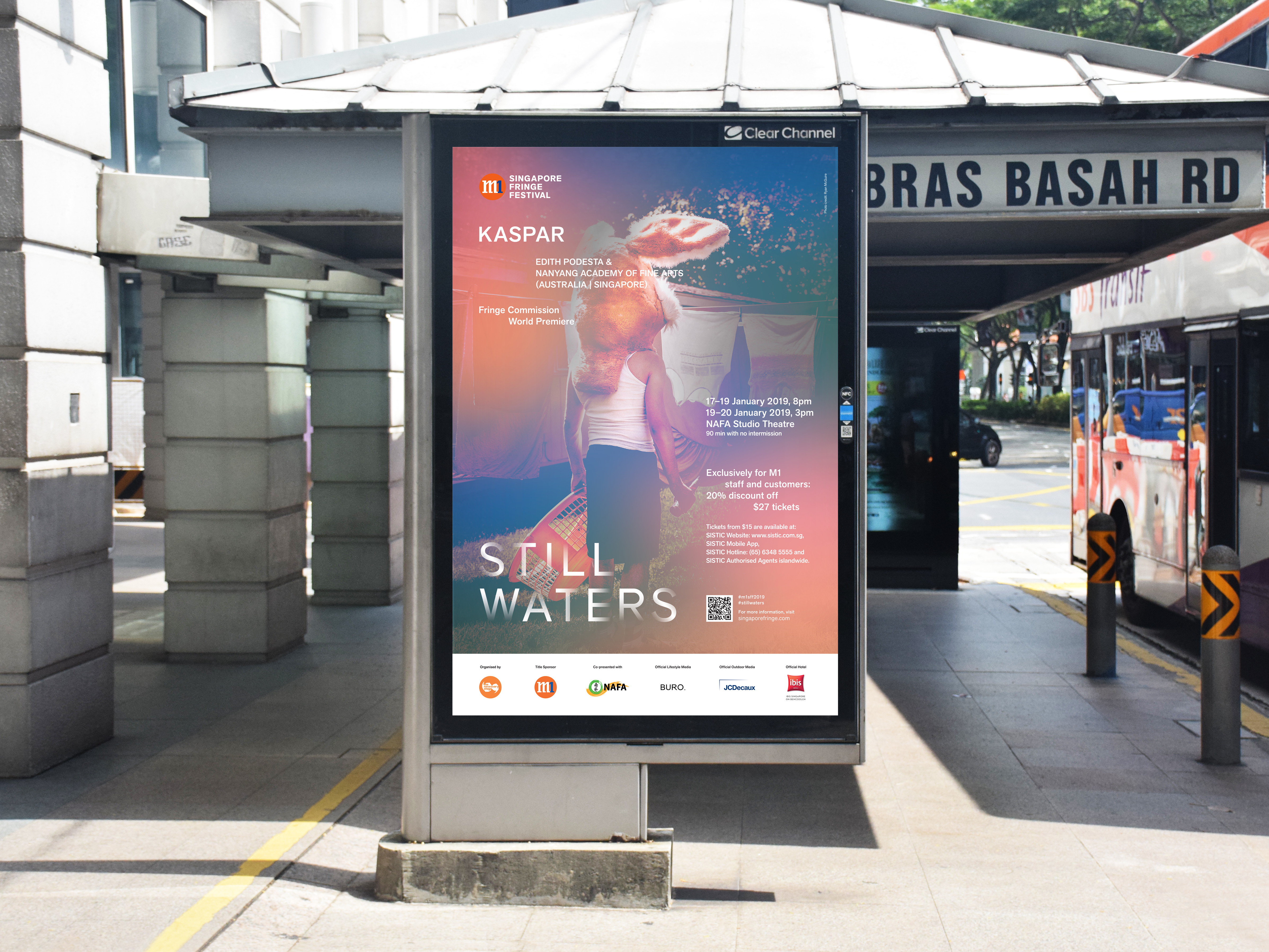
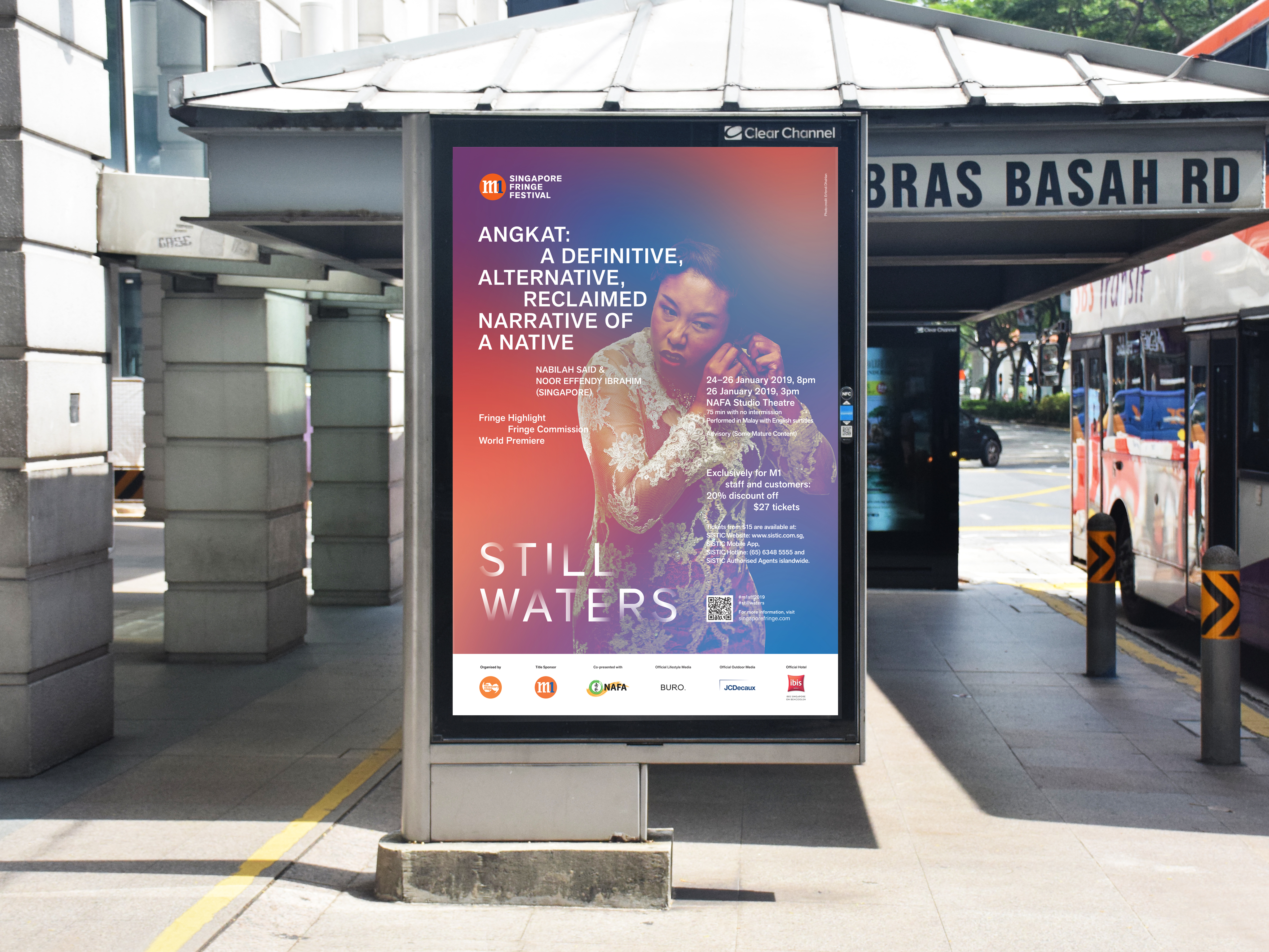
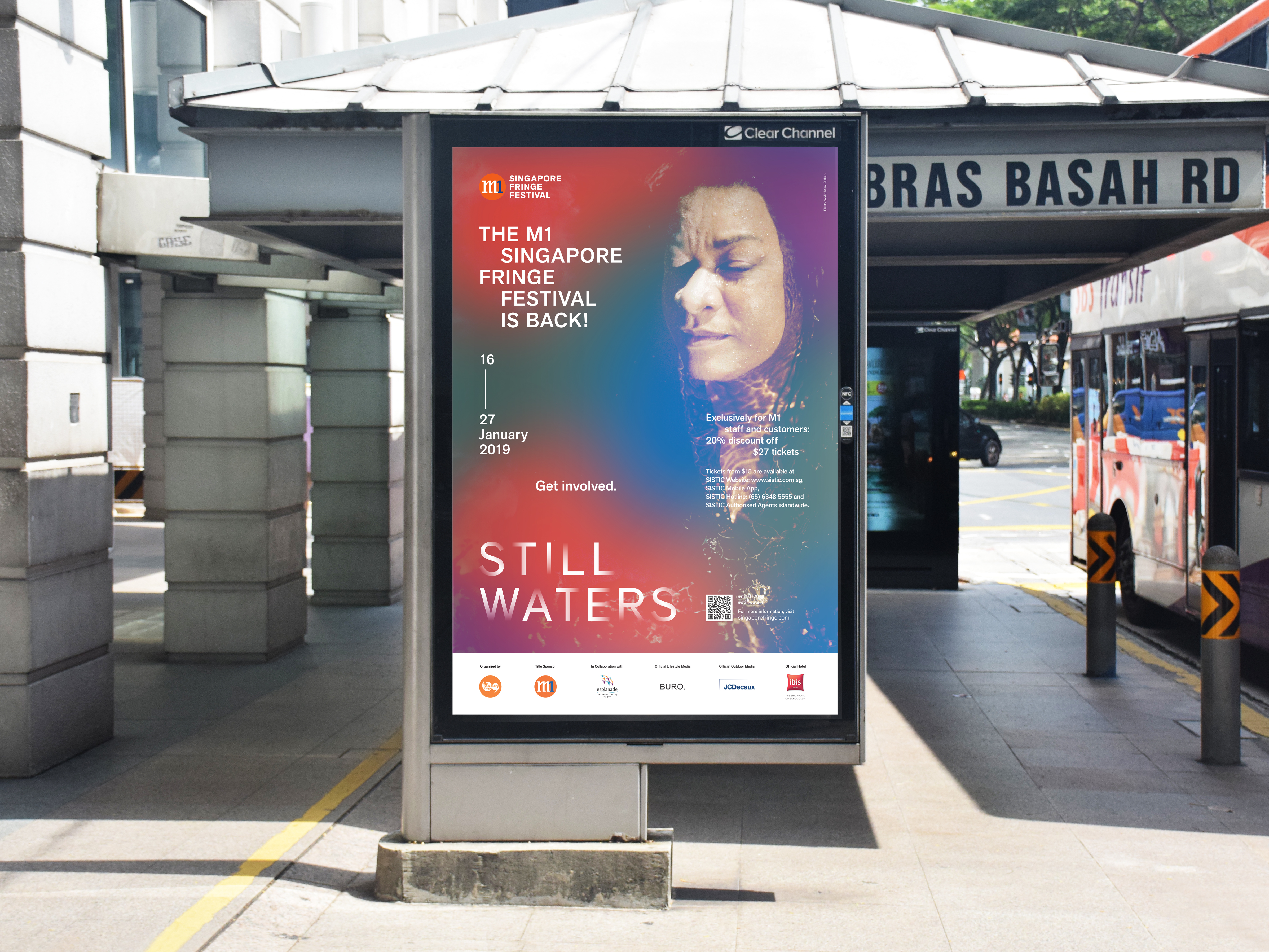
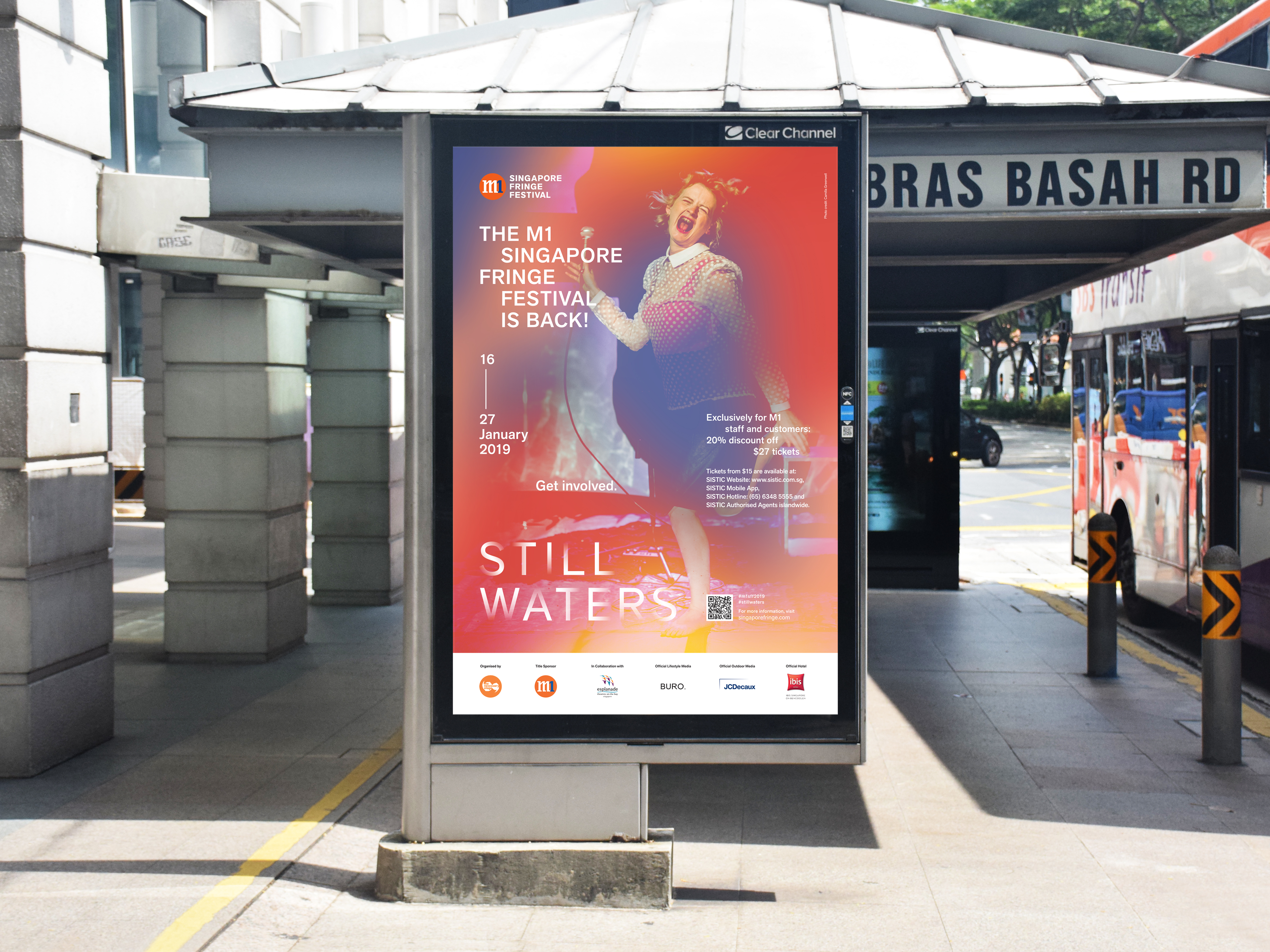
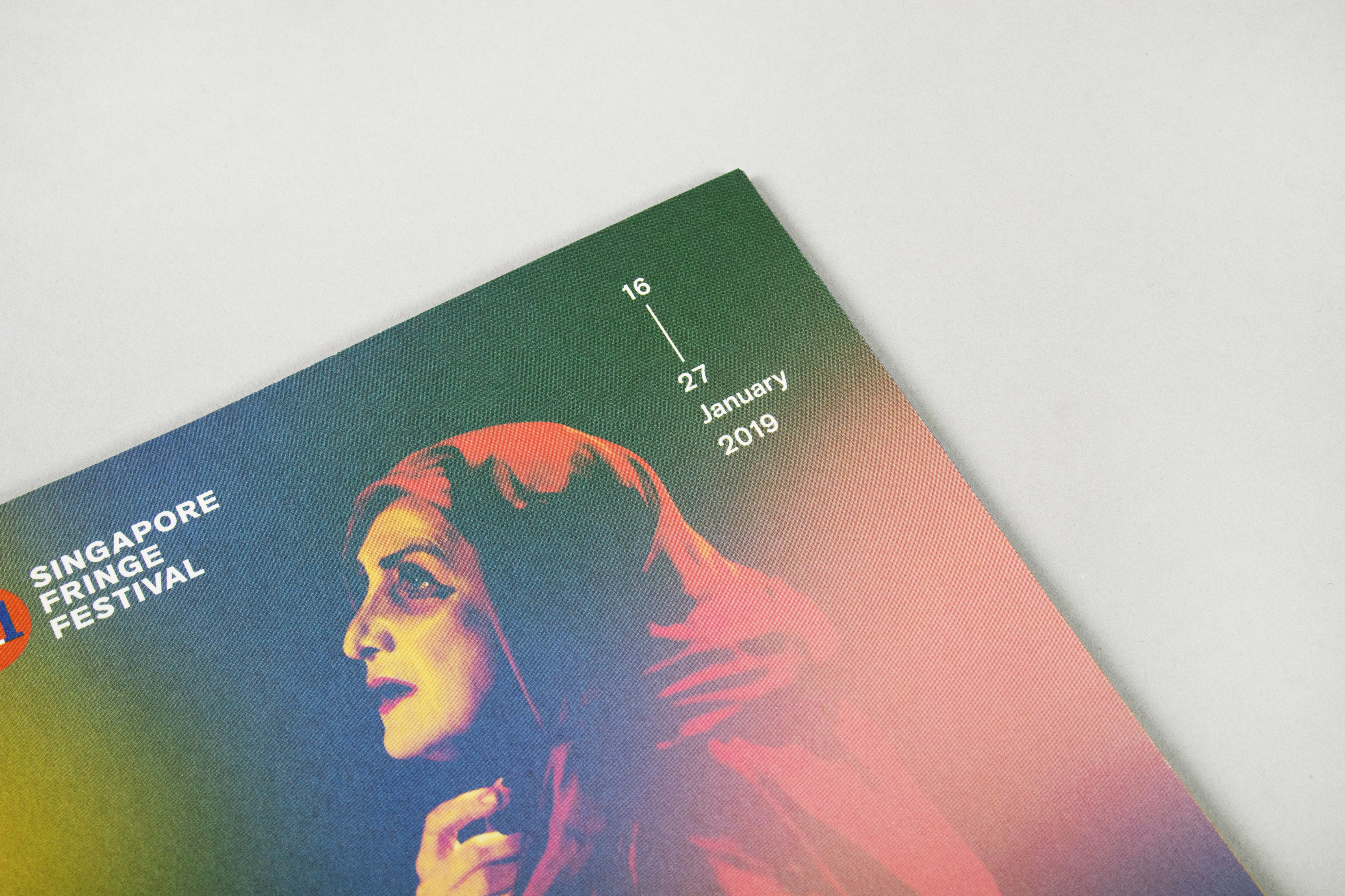
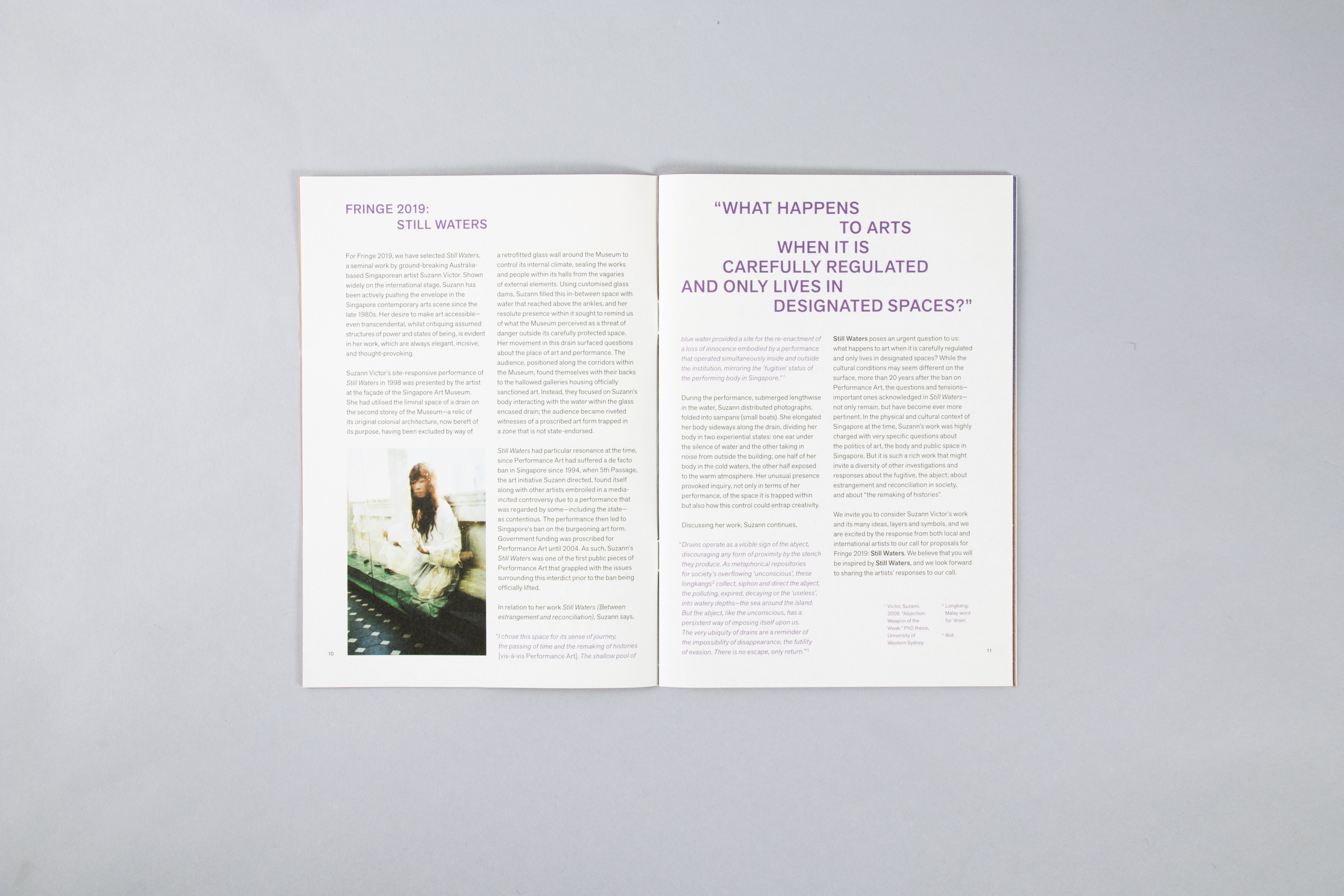
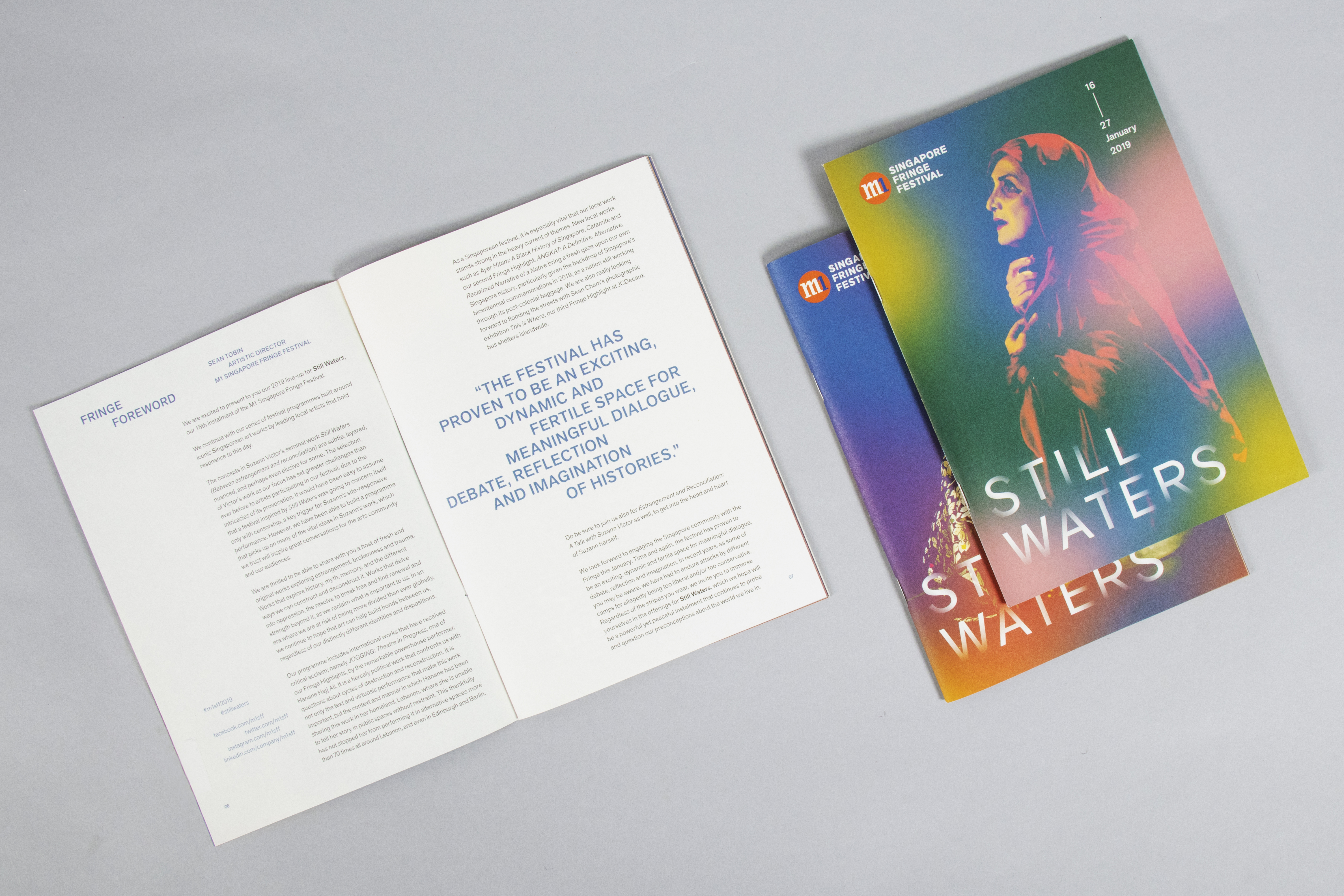
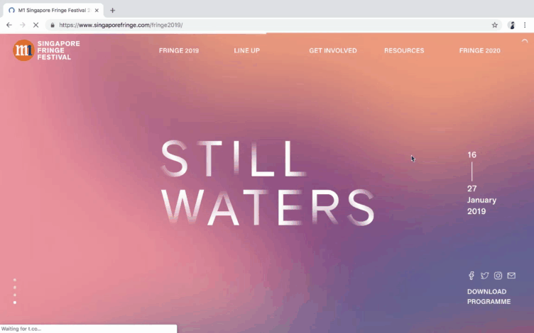
The M1 Singapore Fringe Festival is an annual art festival that brings together theatre, dance, music and visual arts organised by The Necessary Stage. For the 2019 edition, the festival theme was based on a performance piece titled Still Waters (between reconciliation and estrangement) by Suzann Victor which was performed in 1997 at the Singapore Art Museum. It was a piece performed in response to the difficult situation the artist found herself in following the legal proceedings that resulted from Josef Ng’s performance, Brother Cane, held at 5th Passage, a gallery run by Suzann Victor.
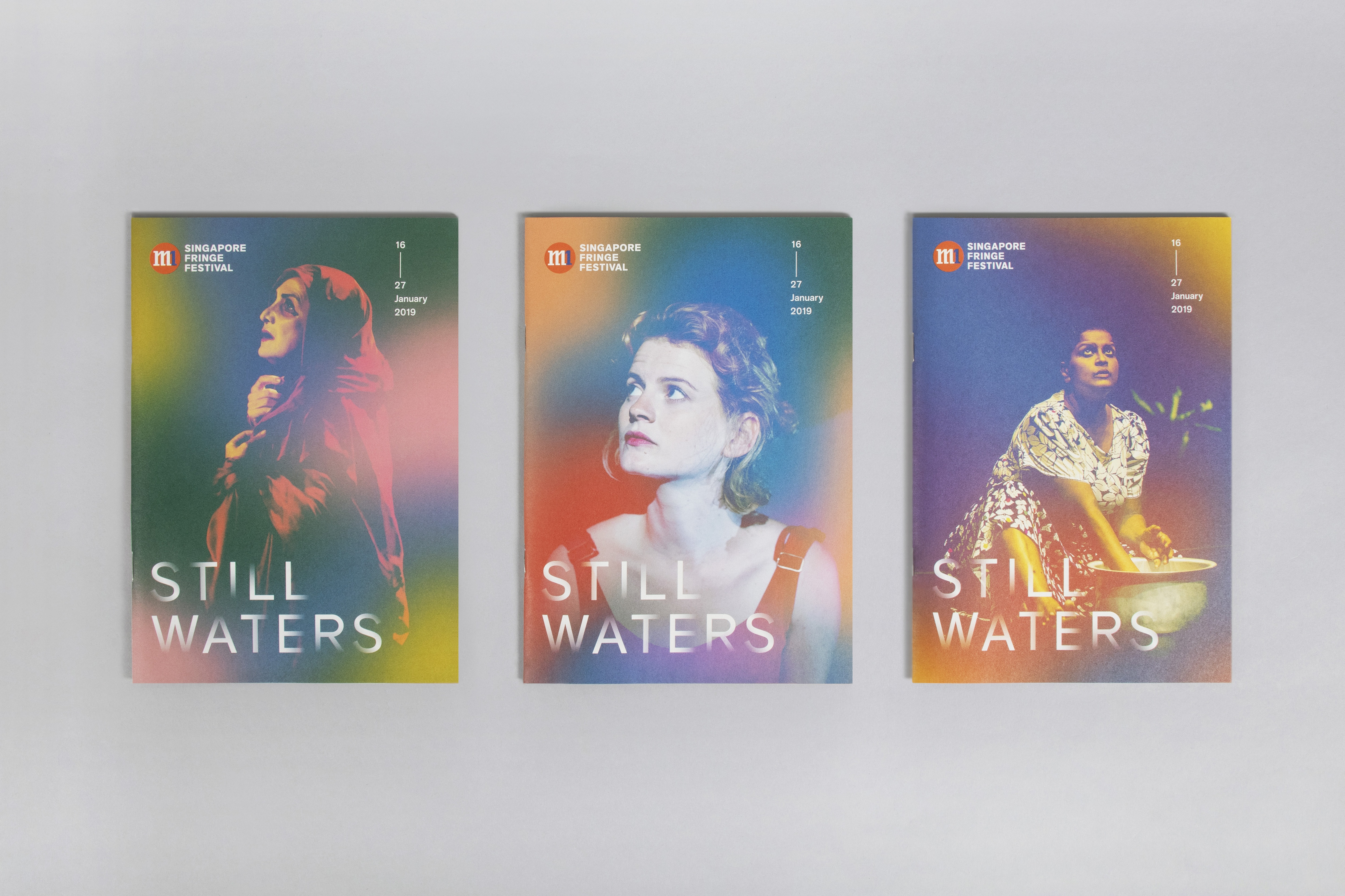
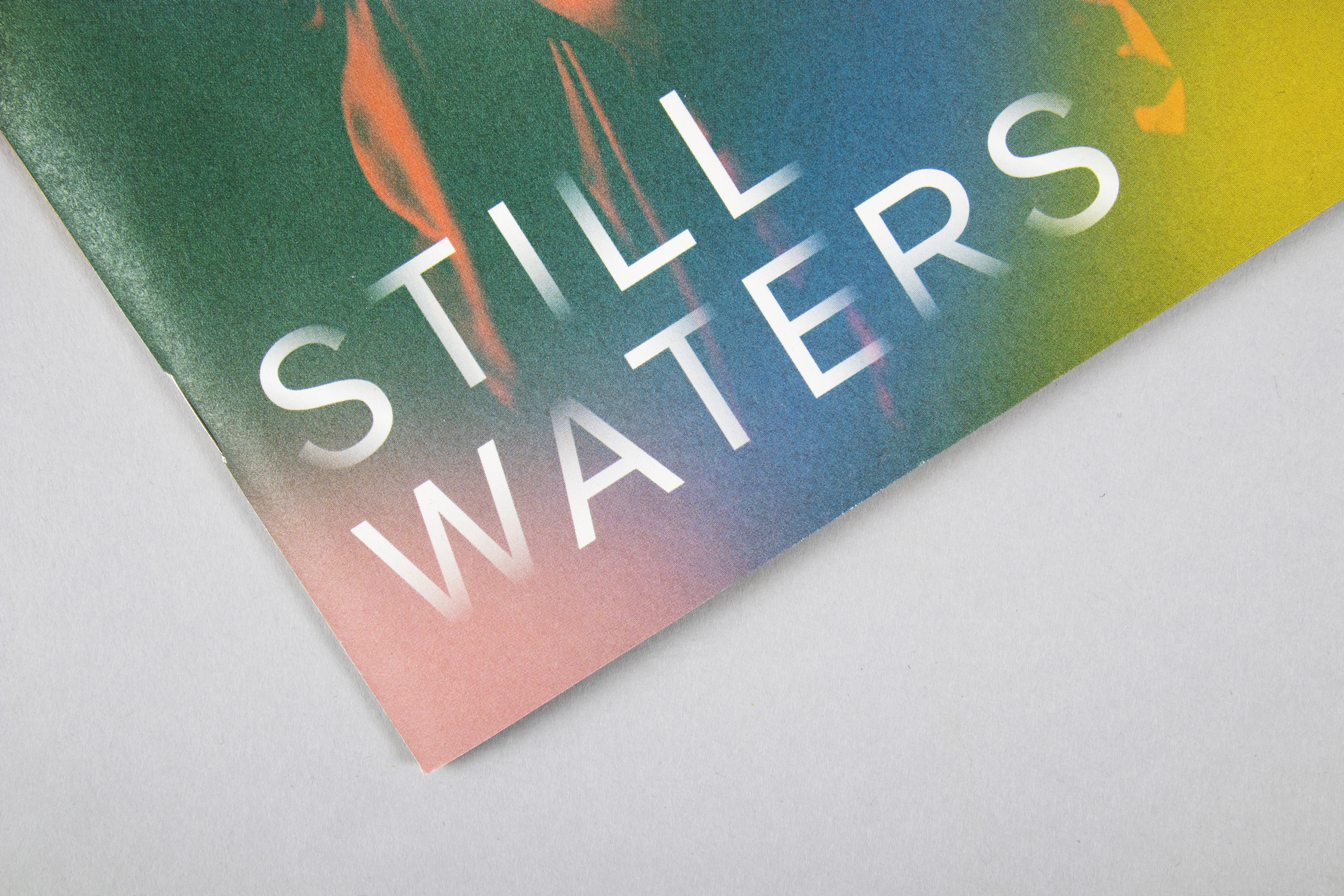
Still Waters inspired us to consider the form and formlessness inherently found in water. The art direction uses coloured organic shapes, manipulated to bring out the soft and fluid characteristics of water. These traits make the shapes appear to change and react with the different performance images that it has been superimposed on, bringing to mind the resilience of the Singapore artistic community that has been adapting and growing alongside shifts in governmental policies. The shapes, when blurred and overlapped, draw on water’s ability to create illusions and transform the familiar in a brand new light. This reinforces the role of the Fringe as a platform that challenges preconceived notions and perspectives, as well as offers an opportunity to re-interpret the world around us with a fresh eye.
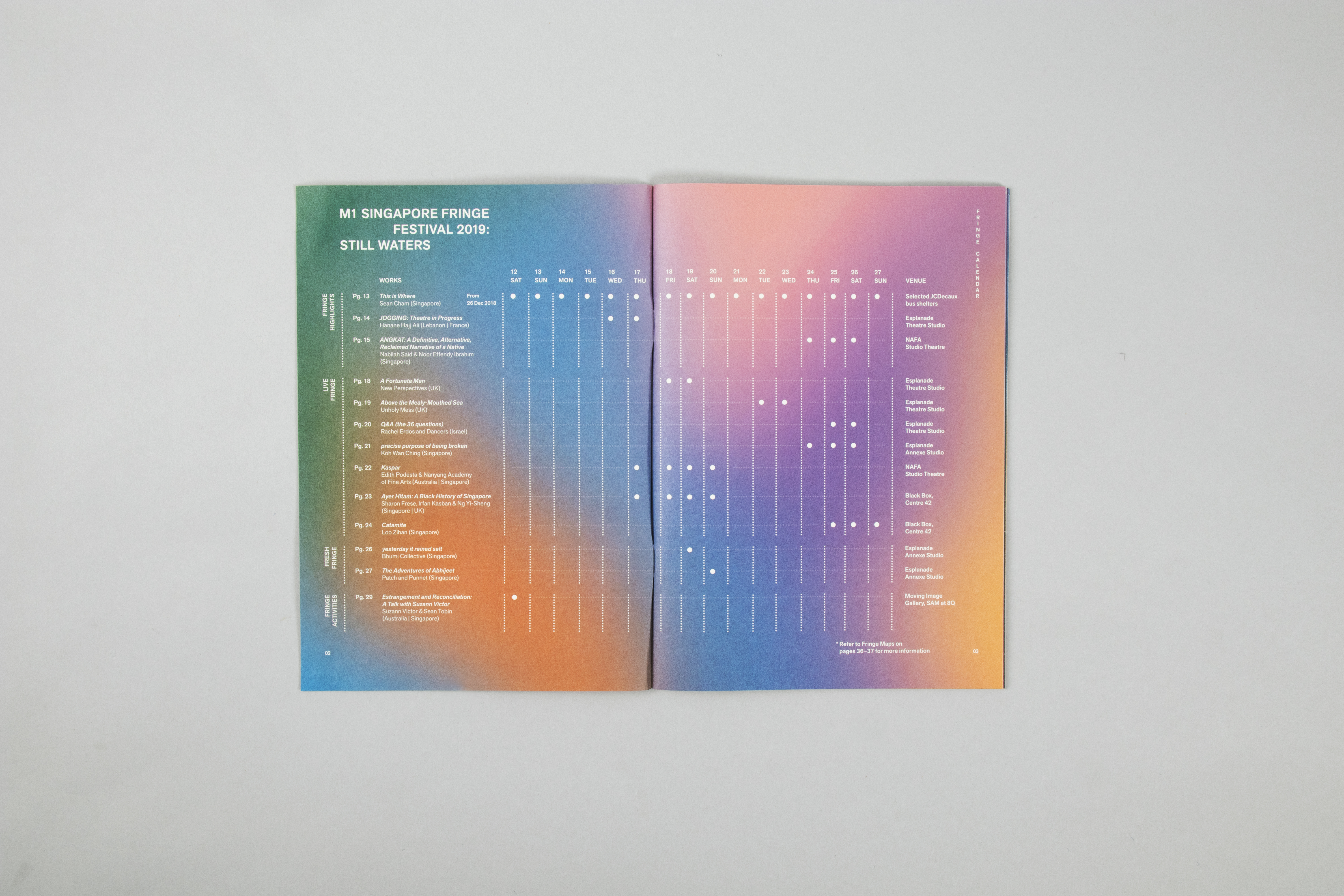
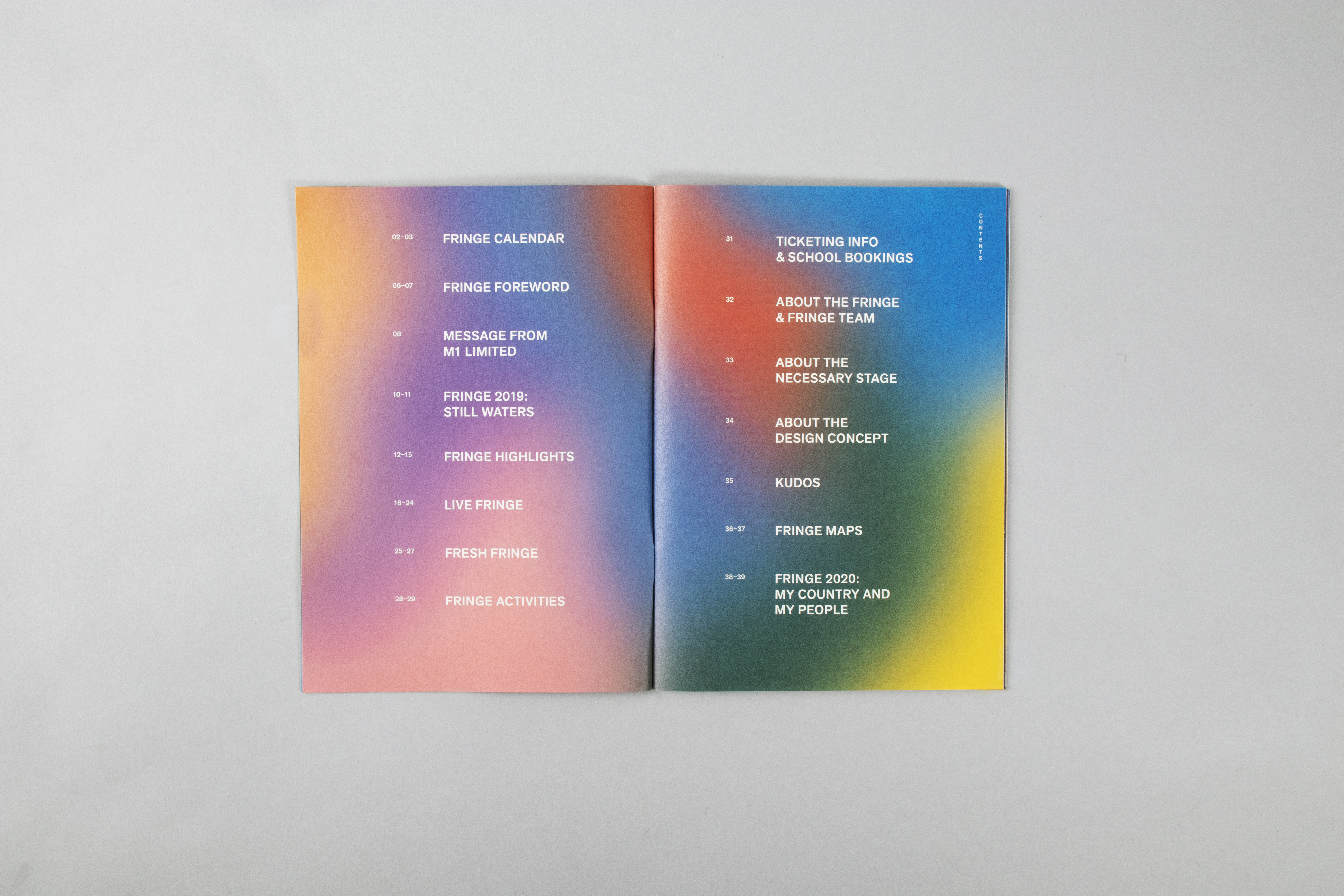
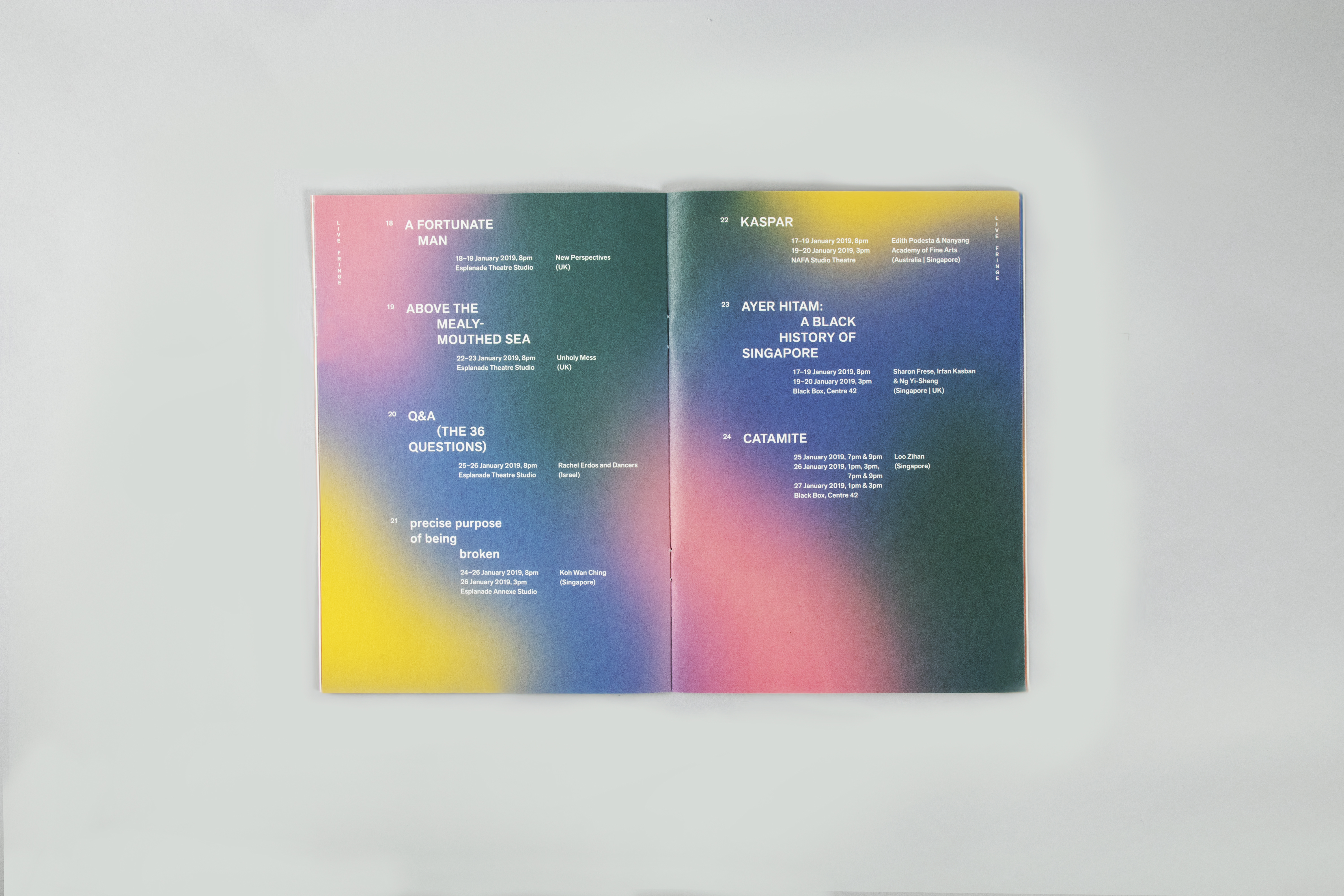
Organic qualities of water is also translated through staggered formations in the typesetting and layout that’s reminiscent of the flow of water as it breaks apart and through a controlled space. On the other hand, the colour scheme is adapted from the rainbow spectrum which can be seen when light hits water, creating a refraction.
Still Waters inspired us to consider the form and formlessness inherently found in water. The art direction uses coloured organic shapes, manipulated to bring out the soft and fluid characteristics of water. These traits make the shapes appear to change and react with the different performance images that it has been superimposed on, bringing to mind the resilience of the Singapore artistic community that has been adapting and growing alongside shifts in governmental policies. The shapes, when blurred and overlapped, draw on water’s ability to create illusions and transform the familiar in a brand new light. This reinforces the role of the Fringe as a platform that challenges preconceived notions and perspectives, as well as offers an opportunity to re-interpret the world around us with a fresh eye.
Organic qualities of water is also translated through staggered formations in the typesetting and layout that’s reminiscent of the flow of water as it breaks apart and through a controlled space. On the other hand, the colour scheme is adapted from the rainbow spectrum which can be seen when light hits water, creating a refraction.
A2 Posters ︎


Logotype ︎
To express the idea of form and formlessness in the logotype, a gradient—creating a binary of a solid form and organic formless entity—appearing through the solid strokes diffuses at the edges creating a transitional effect that fades out into the background.

Programme Booklet ︎


Press Kit ︎


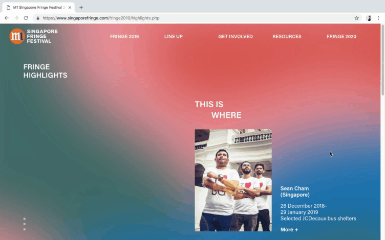
Website ︎
Outdoor Graphics ︎